Why THYKO has no login, no ads, and no business model
Picture the checkout moment: you’re at the register, the cashier is waiting, and you open a loyalty-card app. It asks you to log in. Maybe the password is sitting in your phone’s keychain and it’s instant. Maybe it isn’t, and now you’re typing, or hunting for a reset-password email, while the line behind you grows. Either way, that’s a step nobody asked for, inserted into the two seconds an app like this is supposed to take.
That moment is the entire reason THYKO exists.
The market isn’t empty, it’s just not right
There’s no shortage of apps in this space — Klarna, Satispay, the various wallet apps, store-specific apps for every chain. My partner Claudia and I tried most of them before building anything. None of them stuck. Not because they’re badly made, but because almost all of them come with a login, a connected account, or a notification pushing some offer — things that have nothing to do with “show the barcode” and everything to do with a business model sitting behind the feature.
We’re THYKO’s first users, in the most literal sense: we built the app we kept wishing existed every time we stood at a register fumbling with someone else’s.
| iOS | Android |
|---|---|
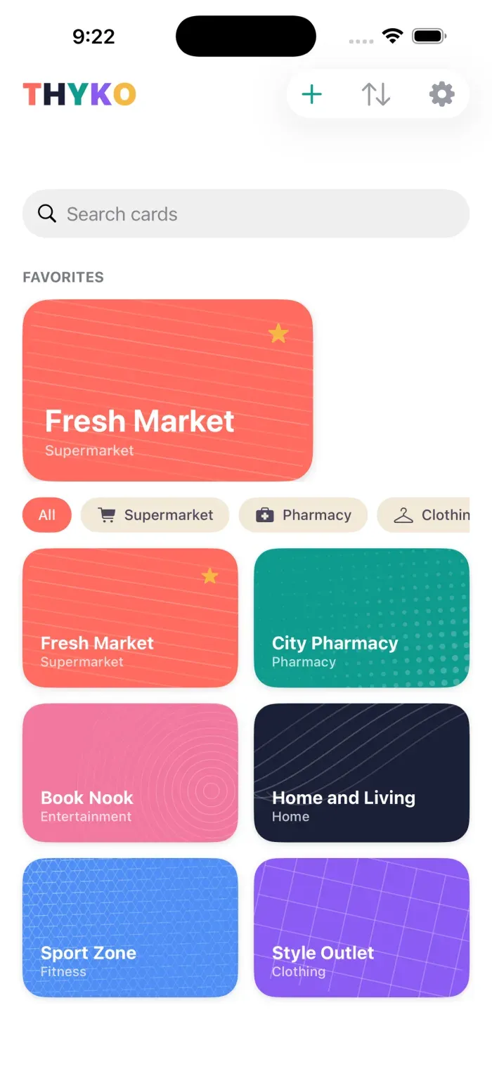 |
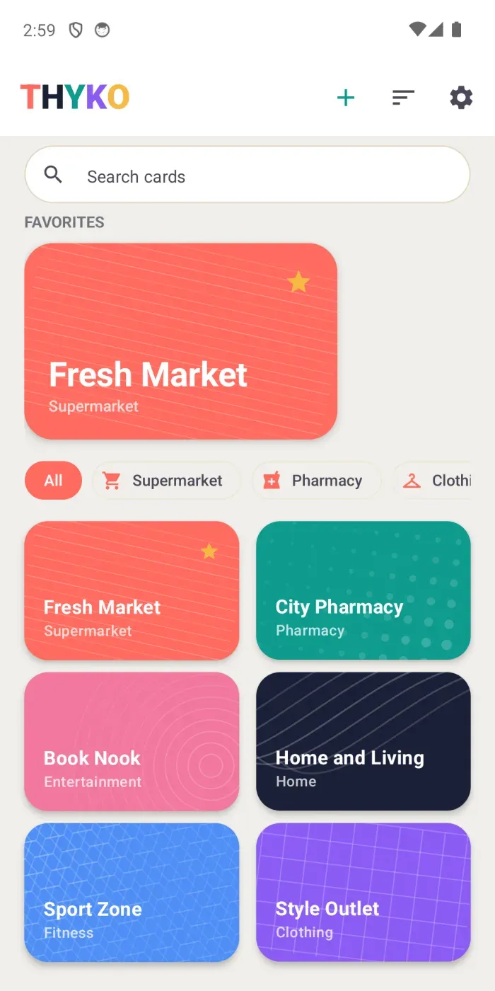 |
No login, no ads, no business model — on purpose
This isn’t a privacy feature bolted on for marketing. It’s the actual constraint the rest of the app had to fit inside. If THYKO asked for an account, it would just be another app with a login screen, and the reason for building it would be gone. If it carried ads, “fast and out of your way” would stop being true the moment a banner showed up.
So: no server collecting your cards, no email or password, nothing syncing in the background. Your cards live on your device. The one exception is a backup, and even that only happens when you choose to export it — never silently, never on a schedule. There’s no revenue model behind THYKO, and it isn’t a loss-leader for something else either. It does one job and doesn’t try to monetize you while doing it.
One rule, applied ruthlessly
Early on I wrote down a single ordering to settle any product disagreement: simplicity, then speed, then privacy, then reliability, then cross-platform consistency, then delight — and only then, additional features. Anything that doesn’t make storing, finding, using, or sharing a card noticeably better doesn’t belong in THYKO, no matter how standard it is in competing wallet apps.
That rule cuts both ways — it also tells you what to remove. The MVP originally had Home, Search, and Categories as three separate tabs behind a bottom nav bar. Once search became a bar sitting right on the Categories grid, Home’s only remaining job was “show favorites instead of everything” — not enough of a distinct job for a wallet that typically holds a handful of cards. So the three screens became one, and Settings moved off the bottom bar entirely. Fewer screens, same wallet, less to tap through at the register.
   iOS (Swift/SwiftUI)         Android (Kotlin/Compose)
   ┌──────────────────┐        ┌──────────────────┐
   │   native UI        │        │   native UI        │
   │   SwiftData         │        │   Room              │
   └────────┬───────────┘        └────────┬───────────┘
            │                              │
            └──────────── THYKO Card Format ───────────┘
                     (one JSON schema, same test
                      fixtures, read by both platforms)
Two separate, fully native codebases — no Flutter, no React Native, no shared UI layer — joined by exactly one shared contract: the card data format itself, checked by the same test fixtures on both sides. Twice the UI work, but no compromise in how either app actually feels. More on why that trade-off was worth it in a future post.
The part that’s just as real: this was a first
THYKO is the first app I’ve ever shipped to the App Store and Google Play, from scratch, by myself, end to end — two native codebases, the store listings and screenshots, the privacy policy, the support inbox, and the little site you’re reading this from. There was a lot I was doing for the first time at every one of those steps, and it was one of the more satisfying things I’ve built, precisely because none of it was abstract — it had to actually clear two different app stores and work for real people at a real register.
This is the first of a few posts on THYKO — the architecture, the card-sharing design, and what’s next are coming. For now: if any of this sounds like your own junk drawer of loyalty cards, THYKO is free on the App Store and Google Play. No account needed to try it — which, at this point, you could probably have guessed.